← Back to blog Abishek Kannan
18 Aug 2026
Faro Build Log: Malleable Charts
Abishek KannanAbishek Kannan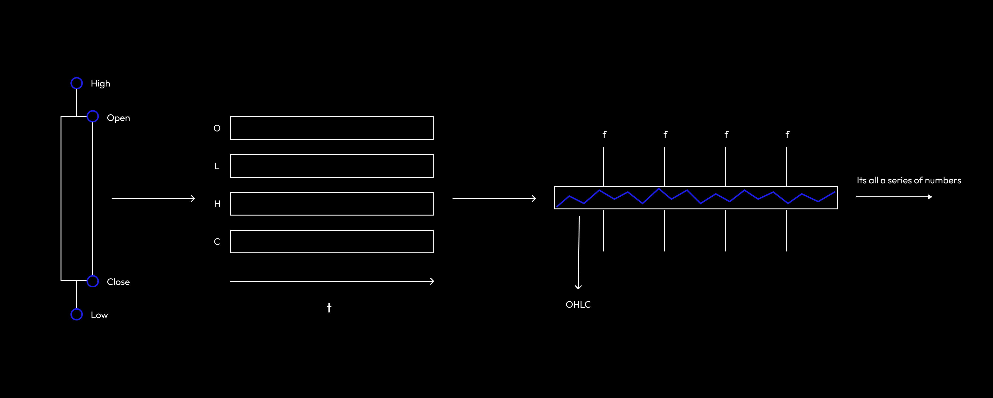
GM,
Charts are a big part of what enables Faro to take you from raw market data to an informed trade in seconds. And we recently rebuilt them from the ground up.
This post walks through what we changed, the decisions behind it, and how we landed on the new design.
But first, a bit of background: I'm Abi. I started my career in crypto at Staking Rewards (recently acquired). At the time it was the de facto place for staking yields across crypto. I was on the data side, leading asset research across every token we tracked and writing the data pipelines behind everything from per-validator performance to network-specific factors affecting staking. After that I moved to Swell, where I led strategy and the launch of Swell L2, which we scaled to $1B in 30 days.
Now I'm building Faro: the AI that sees the entire market and helps you make better trades. Faro bridges the gap between the everyday retail investor and financial data, and makes that relationship personally tailored, so every user gets exactly what's best for them out of the market. Check it out at faro.io.
The charting process today relies on the agent to pull in the data, determine the chart type, and bind everything together using a Python framework. Not terrible, but fundamentally inflexible, leaving lots of room for improvement.

The result of the above process is a single point-in-time snapshot with no flexibility after creation. Your only recourse is asking the agent to rebuild it. And if you've ever asked an agent to redo something it got wrong, it's getting better at that, but usually it sucks. There's a reason it arrived at that initial conclusion, and pulling it out of that is difficult.
And, since a lot of the logic sits inside the LLM, the process itself is ambiguous and difficult to finely tune. As we have repeatedly discovered: LLMs are extremely powerful, but giving them too much to do at once takes away from the end product.
That’s why we have adopted an approach to design where we break everything down into its smallest components, then build back up with each component as close to perfectly designed as possible.
Another problem highlighted early on is that agent responses were leaning towards written output instead of charts.
This was because we were asking the agent to do so much in the charting process that a lot of its bandwidth was consumed making charts. The end result was the agent avoiding charts precisely when users wanted them. It was trading off between spending all this context making a chart versus writing the answer in bullet points, and it leaned toward bullet points. But while agents love written output, humans absorb things visually.
The lesson is that any new architecture had to make charts cheap for the agent to produce, so its bandwidth went into answering the question, not constructing the visual.
One user feedback call captured the next improvement point well. Their gripe was that every Coinbase Premium chart across every site, including ours, simply compares the BTC price between Coinbase and the Asian exchanges at face value — missing the context that the Asian exchanges use USDT while Coinbase uses USDC. Thus to get a true representation of US demand you have to adjust for the USDC/USDT rate.
We could have shipped that fix right away, it's simple. But the key insight is that this is really just two series of numbers interacting, and it's a single permutation of something that would be broadly useful if charts could interact generally. From a UI perspective, why can't you just drag one onto the other, define the interaction (series 1 divided by series 2), and get exactly what you want?

Similarly, another feedback call fed heavily into the redesign. A user said: it's great you have CVD (cumulative volume delta) data, but I want to see it as a candlestick chart.
Ultimately, we concluded that the UI should show every chart type possible for any given set of data.
All this discussion took us back to thinking about what a chart actually is. Take a single candle: you have the open, high, low, close — OHLC. If you have OHLC data you can make a candlestick chart. Step back: that's just four time series on the same time scale, four series of numbers that form the candlestick. Take another step back: candles also denote frequency. One-minute candles want the open, high, low, close of the data within that minute. So rather than four series, you can reimagine candles as what they actually are: a single continuous series of data, split by frequency, with four specific numbers picked out of each bucket.

Taking it back to basics, most charts are derived from a series of numbers and how those series interact. Thinking this way lets you be very abstract, and you break everything down into its smallest components to enable maximum flexibility.

It's not on us to decide whether data should fit a chart, only whether it can. The one thing we're opinionated on is enabling all configurations. Our job is to enable every permutation of data-to-chart that's possible, because there may be some user out there for whom this visual configuration is exactly what they want.
Transformers are what enable multiple configurations. We have an ever-expanding pool of data sets, each of which carries a canonical shape declaration — e.g. "this is time series data, single series, this is its shape."
Then each transformer has an input shape and an output shape, so not every transformer accepts every data type. For example, a moving average transformer takes time series data plus a parameter (which moving average you want).
The agent's flow is then: what chart do I think this user wants? What data do I need? And which transformer gets me to the target shape?

Where this gets really cool (yes I'm a nerd about this stuff) is that the agent will select the chart it thinks is best, but once everything is shapes, the user can change the format of the chart directly, e.g line to bar, on the UI without going back to the agent.
This becomes a data point for personalization: Faro can note "the agent thought this user wanted a line chart, but they switched it to a bar chart on the UI — record that this user wants this data as a bar chart." Then next time, the agent automatically presents it that way.
The user's input becomes effectively training data that shapes how the agent operates, and over time the system evolves to suit that specific user.
We believe this way of building interfaces – with user configuration and personalization – is the future and that agents will be companions of users, in charge of configuring your interface to be perfect for the user they serve.

Early iterations of v2 Funding Rate charts
I hope this was informative and explains some of the considerations behind how we're building charts.
If you have thoughts or feedback, leave a comment, we'd love to hear what we might have missed or how we could think about this better.
Up next: our counterintuitive approach to data retrieval, and how the agent keeps up with an ever-expanding database while fine-tuning its search to the specific user
P.S. If you haven't already, check out faro.io. We're very close to launching a trading competition, and we'll be giving away a month of Faro Pro to everyone who signs up. Around $10,000 in prizes. Thanks so much.
If you’d prefer to listen to me yapping about this then head to YouTube.

Join our 30-day trading contest and receive 30 days of Faro Pro free (worth $249), including unlimited credits and advanced market intelligence.
Not interested in the contest?